
Page Hierarchy
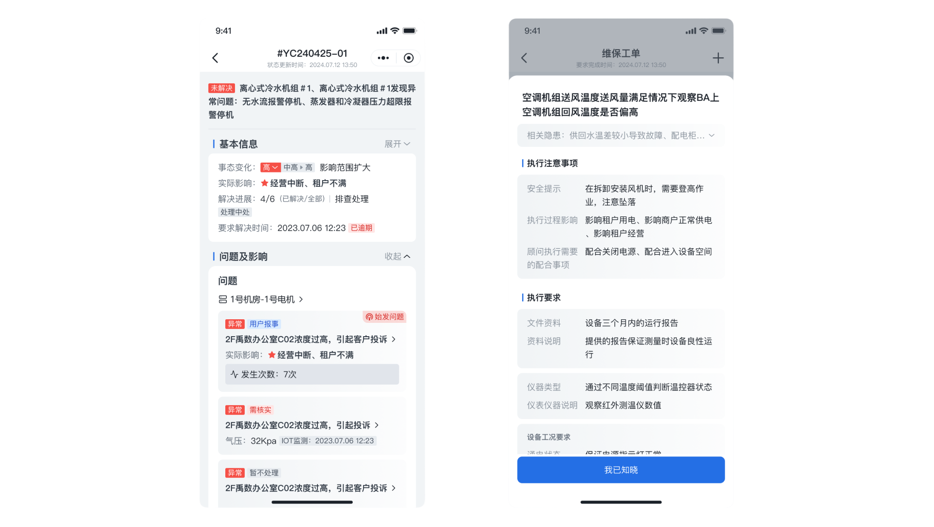
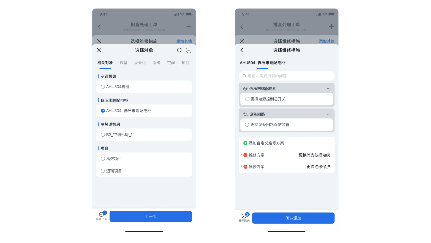
- Non-application page hierarchy should not exceed 5 levels; panel hierarchy should not exceed 2 layers (content can be expanded through left-right interactions within the panel); there is no limit on the number of hierarchy levels for pages encapsulated within the application; for requirements with relatively opposing functional modules, complex information dimensions, and multiple secondary trigger operations, it is recommended to use independent pages. For requirements that involve high viscosity data interaction with the current page (such as real-time viewing, data entry, and data echoing), dynamic panels are recommended.
For example: In the process of troubleshooting, the option to select measures for [Add Others] provides a dual-layer panel and left-right interaction handling.
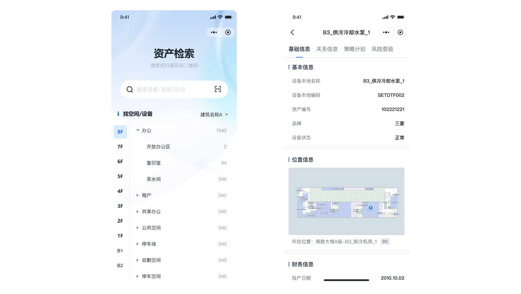
For example: In asset retrieval, there may be multi-level drilling, so application structure encapsulation is performed.
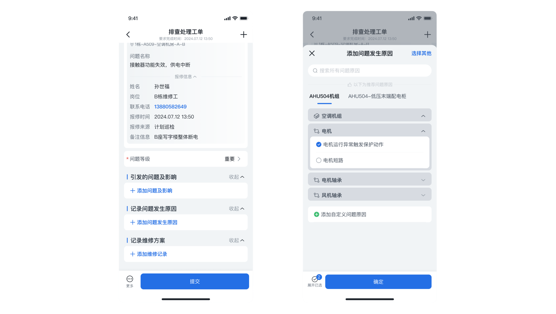
For example: In the scenario of executing troubleshooting work orders, where functionality is independent, information dimensions are complex, and there are many triggering interactions, a page is used. Adding the reason for the issue requires real-time echoing to the execution page, hence a panel is used.
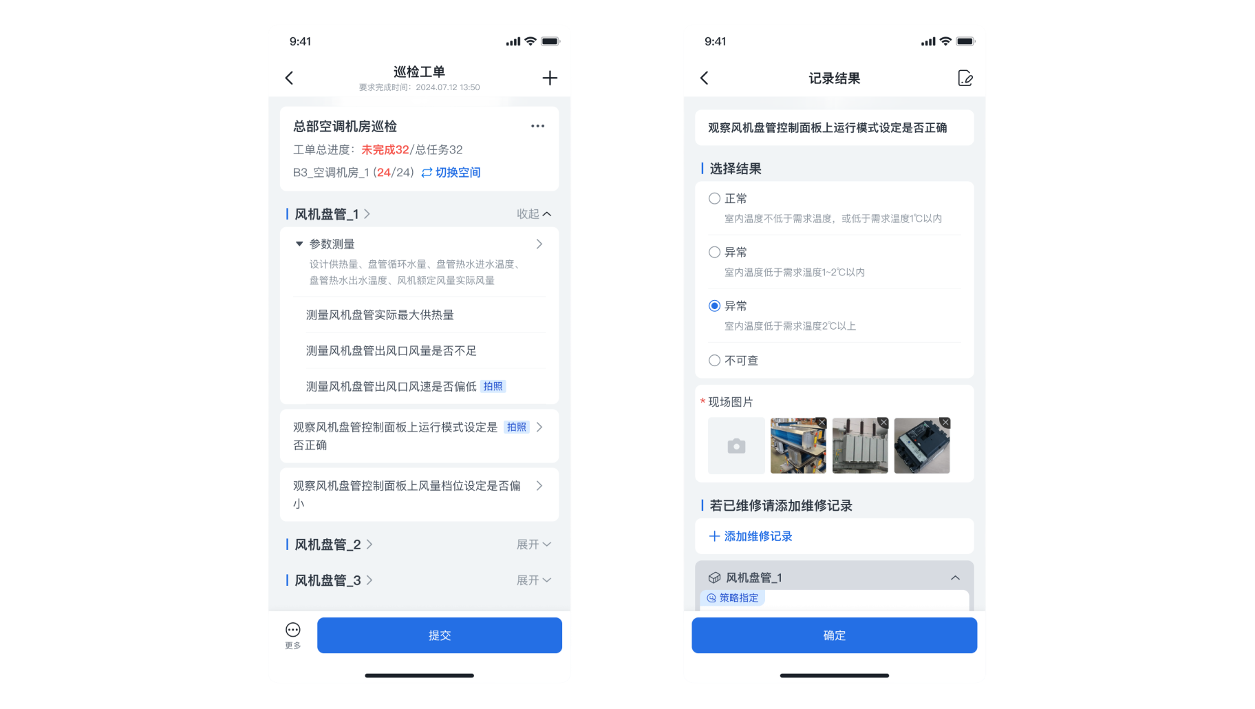
For example: In inspection work orders, clicking on a single task record result, although the data is highly sticky, the related triggering operations are too numerous to be supported only through an independent page.
Micro-interaction
- The normal entry/exit of the drill-down page uses horizontal movement, while the upper-left close icon should use vertical movement for entry/exit. Expanding and collapsing should have easing effects, and the dynamic panel can simply follow the component effects. The app has native page micro-interaction styles for both iOS and Android; if the functionality involves native page construction, the corresponding developers should be contacted for iOS/Android interaction effects. The features built on H5 pages should try to utilize components, which come with built-in micro-interaction effects. If the development implementation lacks effects, they should familiarize themselves with the component usage instructions.
You can view the micro-interaction demonstration video above.
Spacing
- The card content area has a standard spacing of 12px from the top navigation bar. To facilitate alignment with other component elements, the card content area has a standard left and right spacing of 16px. The standard spacing between cards is 6px (for special scenarios, spacings of 8, 12, or 16 can be chosen).
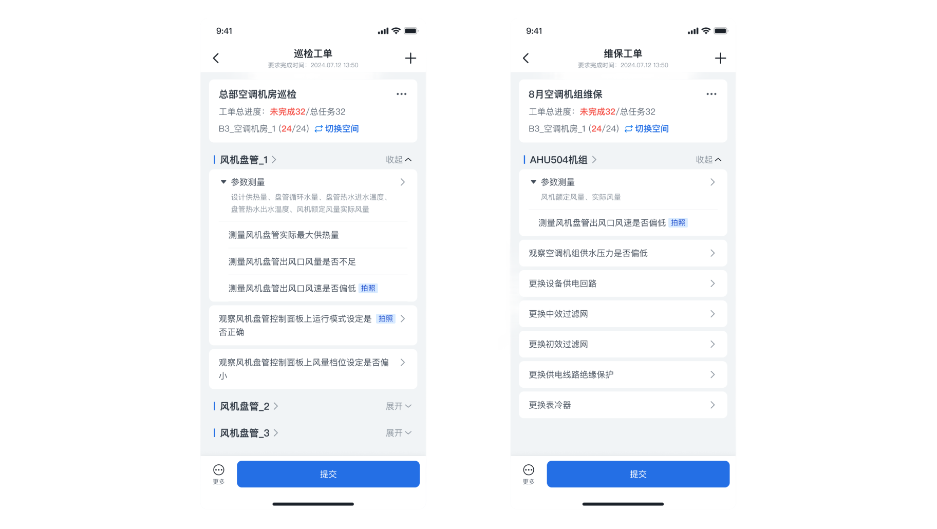
For example: the spacing of card modules in inspection work orders.
Font Size
- To ensure a more stable display effect, the font on mobile devices follows the system font of the device, and there is no need to separately deliver it to developers (the design can use PingFang for design). The primary title text uses a bold size of 16 (higher-level titles in other scenarios can have custom sizes). The secondary title is 14 bold, and the general body text is 14 (visual hierarchy can be distinguished by color). Detail supplementary text can use size 12, and bottom menu text can use size 10 (the smallest text). Clickable and emphasized text can be bolded or visually guided through the use of penetrating icons.
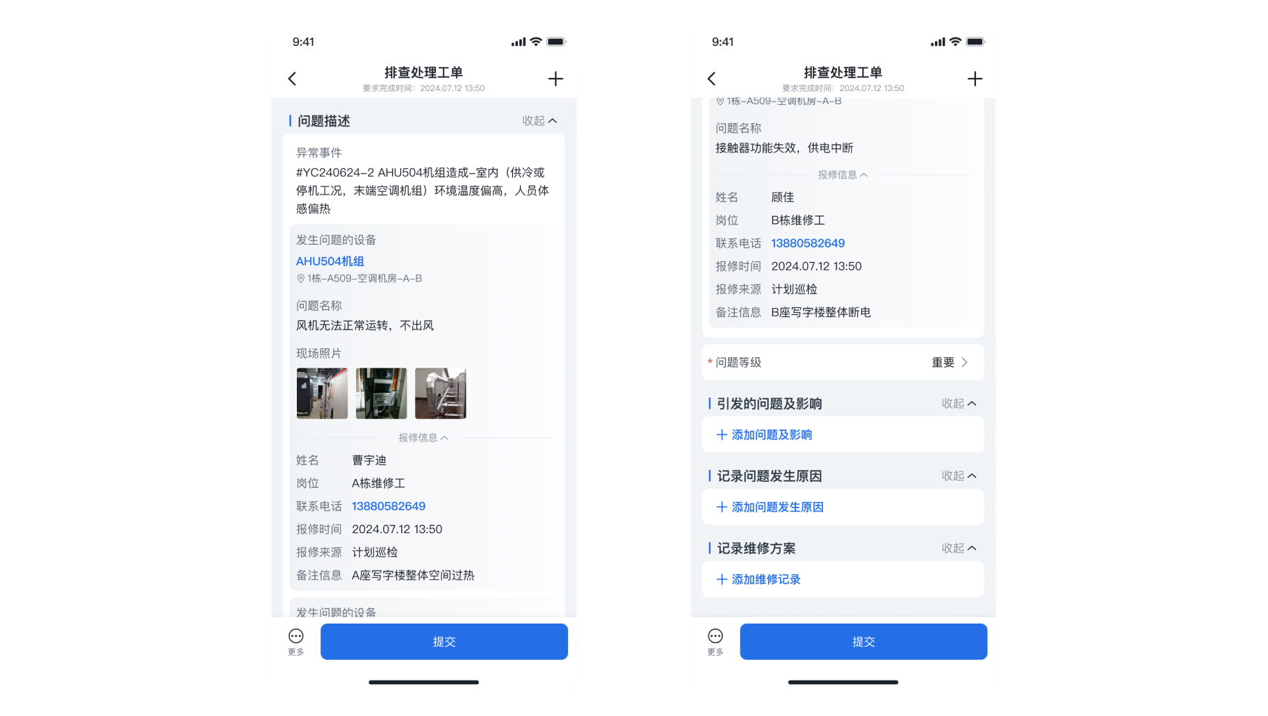
For example: the font sizes used for the small blue label, body text, and clickable text in the issue description of the troubleshooting work order.
Small Blue Label
- The mobile component provides two font sizes for the small blue label: 14 and 16. In most scenarios, the small blue label is used as a primary heading (16). In some cases, it may be necessary to categorize secondary headings under the primary heading using the small blue label at size 14;
- The text of the small blue label should align with the content below, which can be left-aligned with the image below;
- To ensure better spacing consistency, the small blue label header component can be used;
- The text of the small blue label can wrap and be truncated if it exceeds the limit, with wrapping needing to be top-aligned;.
For example: the use of the 16-size small blue label in the list of abnormal events and the 14-size small blue label in the details of measures.
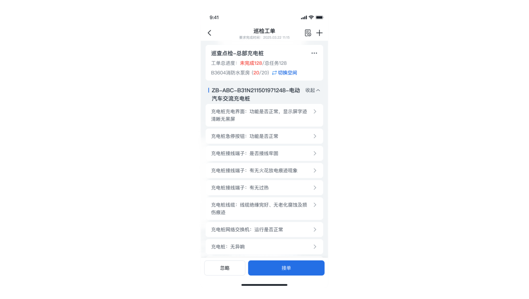
For example: in the inspection work order, the technician needs to view the full equipment name, which should be handled with wrapping.
Meri Design
En
中
Page Hierarchy
- Non-application page hierarchy should not exceed 5 levels; panel hierarchy should not exceed 2 layers (content can be expanded through left-right interactions within the panel); there is no limit on the number of hierarchy levels for pages encapsulated within the application; for requirements with relatively opposing functional modules, complex information dimensions, and multiple secondary trigger operations, it is recommended to use independent pages. For requirements that involve high viscosity data interaction with the current page (such as real-time viewing, data entry, and data echoing), dynamic panels are recommended.
For example: In the process of troubleshooting, the option to select measures for [Add Others] provides a dual-layer panel and left-right interaction handling.
For example: In asset retrieval, there may be multi-level drilling, so application structure encapsulation is performed.
For example: In the scenario of executing troubleshooting work orders, where functionality is independent, information dimensions are complex, and there are many triggering interactions, a page is used. Adding the reason for the issue requires real-time echoing to the execution page, hence a panel is used.
For example: In inspection work orders, clicking on a single task record result, although the data is highly sticky, the related triggering operations are too numerous to be supported only through an independent page.
Micro-interaction
- The normal entry/exit of the drill-down page uses horizontal movement, while the upper-left close icon should use vertical movement for entry/exit. Expanding and collapsing should have easing effects, and the dynamic panel can simply follow the component effects. The app has native page micro-interaction styles for both iOS and Android; if the functionality involves native page construction, the corresponding developers should be contacted for iOS/Android interaction effects. The features built on H5 pages should try to utilize components, which come with built-in micro-interaction effects. If the development implementation lacks effects, they should familiarize themselves with the component usage instructions.
You can view the micro-interaction demonstration video above.
Spacing
- The card content area has a standard spacing of 12px from the top navigation bar. To facilitate alignment with other component elements, the card content area has a standard left and right spacing of 16px. The standard spacing between cards is 6px (for special scenarios, spacings of 8, 12, or 16 can be chosen).
For example: the spacing of card modules in inspection work orders.
Font Size
- To ensure a more stable display effect, the font on mobile devices follows the system font of the device, and there is no need to separately deliver it to developers (the design can use PingFang for design). The primary title text uses a bold size of 16 (higher-level titles in other scenarios can have custom sizes). The secondary title is 14 bold, and the general body text is 14 (visual hierarchy can be distinguished by color). Detail supplementary text can use size 12, and bottom menu text can use size 10 (the smallest text). Clickable and emphasized text can be bolded or visually guided through the use of penetrating icons.
For example: the font sizes used for the small blue label, body text, and clickable text in the issue description of the troubleshooting work order.
Small Blue Label
- The mobile component provides two font sizes for the small blue label: 14 and 16. In most scenarios, the small blue label is used as a primary heading (16). In some cases, it may be necessary to categorize secondary headings under the primary heading using the small blue label at size 14;
- The text of the small blue label should align with the content below, which can be left-aligned with the image below;
- To ensure better spacing consistency, the small blue label header component can be used;
- The text of the small blue label can wrap and be truncated if it exceeds the limit, with wrapping needing to be top-aligned;.
For example: the use of the 16-size small blue label in the list of abnormal events and the 14-size small blue label in the details of measures.
For example: in the inspection work order, the technician needs to view the full equipment name, which should be handled with wrapping.
Press Effect
- Buttons, forms, and other elements in the mobile component all provide a press effect. Unless necessary, please use components to trigger actions to ensure the press effect. If you need to customize buttons or other triggering controls, you must design a press state (and show it in the design documentation; if the press state is not mentioned, developers generally will not add it proactively);
- Instant feedback controls (switches, radio buttons, checkboxes, scroll wheels, sliders, expand/collapse, etc.) may not provide a press effect;
- Text that triggers a click also needs to provide a press state.
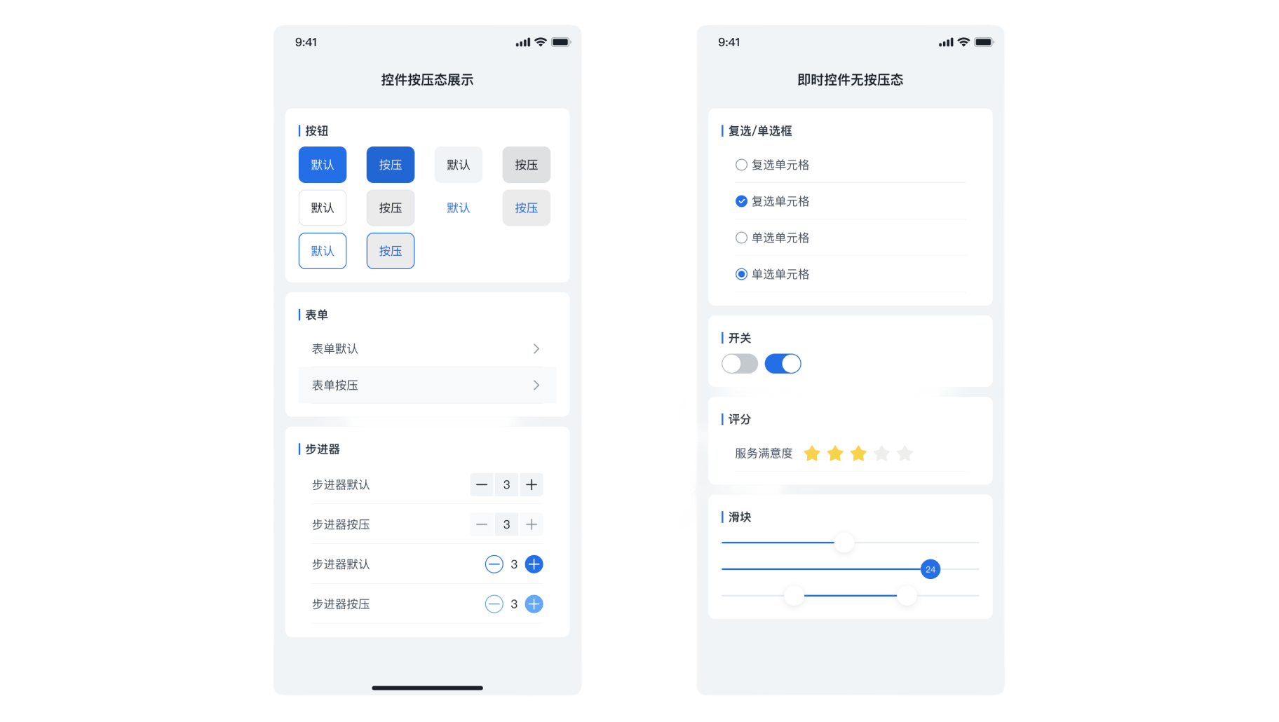
The mobile components all provide a complete press state (instant controls do not have a press state).
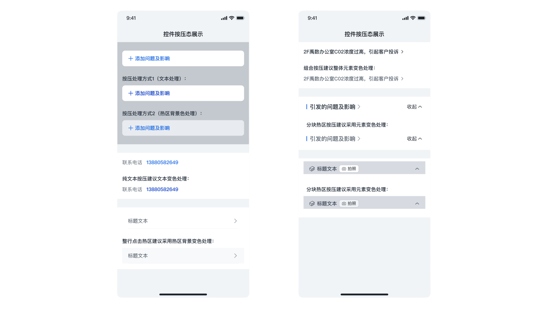
You can choose an appropriate press handling method based on the specific style of the triggering control.