
Design Call
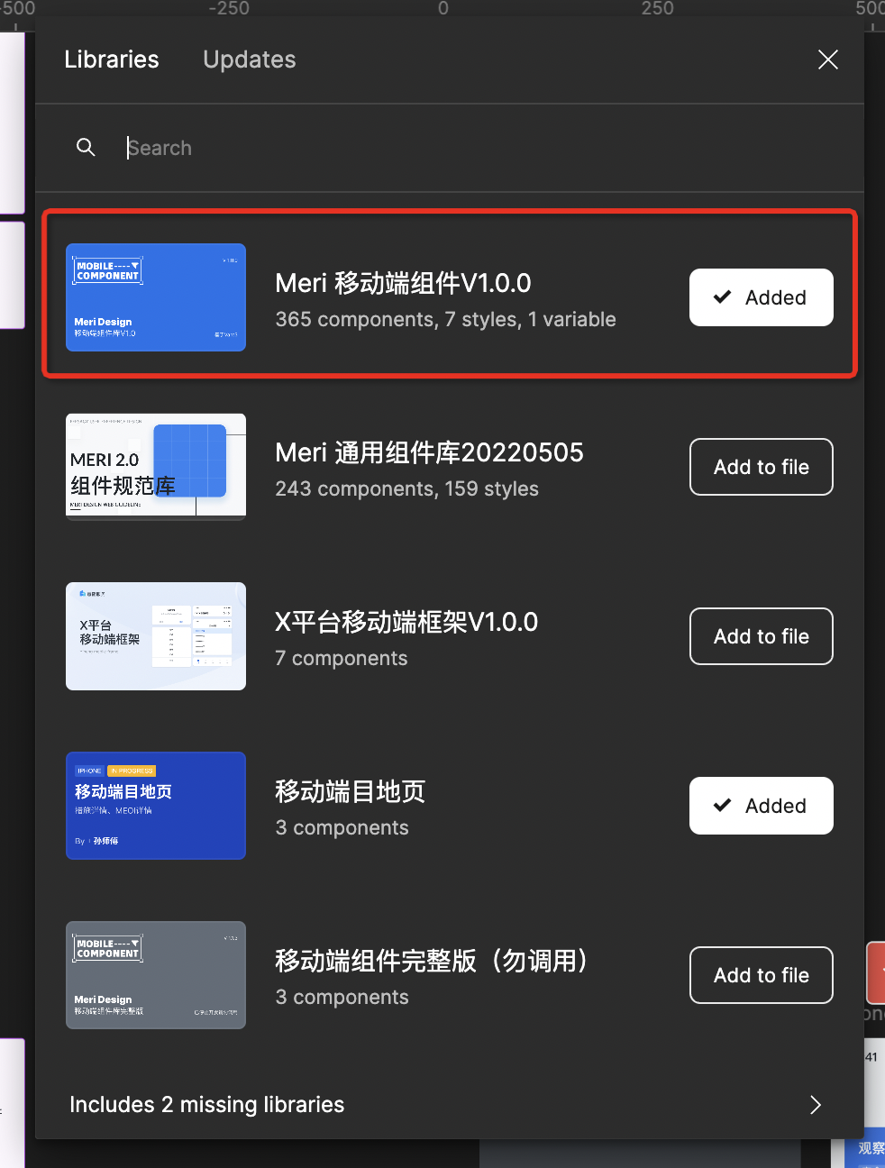
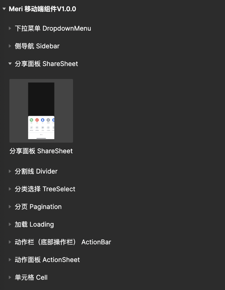
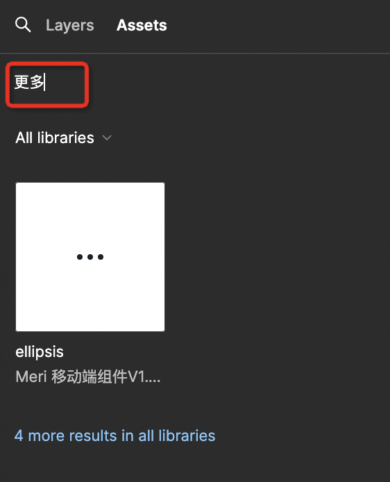
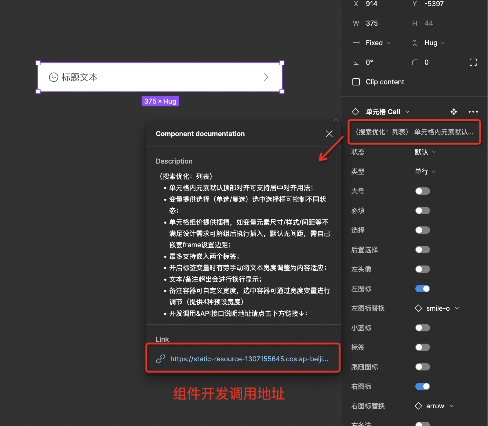
- Team members can directly enable components through the component panel. Once enabled, they can search or find calls directly through the component panel. Non-team members can copy the documentation and publish components for use within their own teams. The component has been optimized for search keywords; for example, the [Cell] component can also be found using the [List] keyword. Icon naming has also been made compatible for search (supporting Chinese naming searches), aligning better with designers' search habits.
Design Component Variable Description
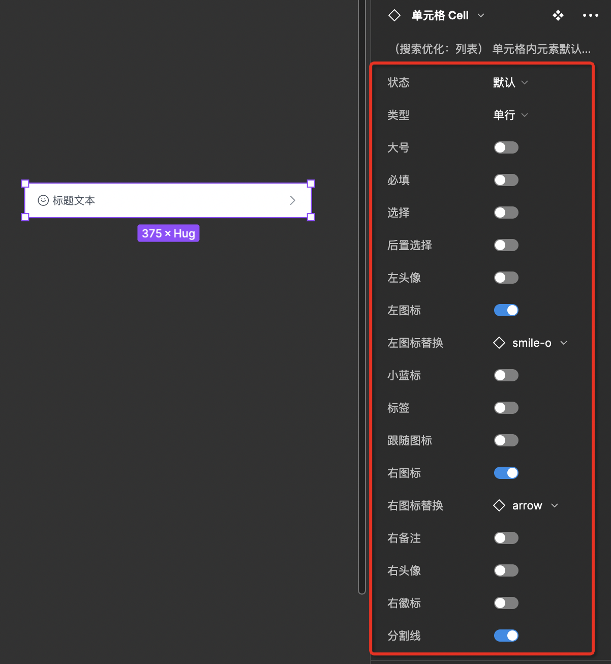
The component offers rich variable controls (different types and states, slot visibility control, quick icon replacement, etc.)
Single Component Usage Instructions
The component includes relevant usage instructions, such as usage specifications, extreme case handling instructions, and variable extensions supported by development.
Usage Instructions in Development Mode
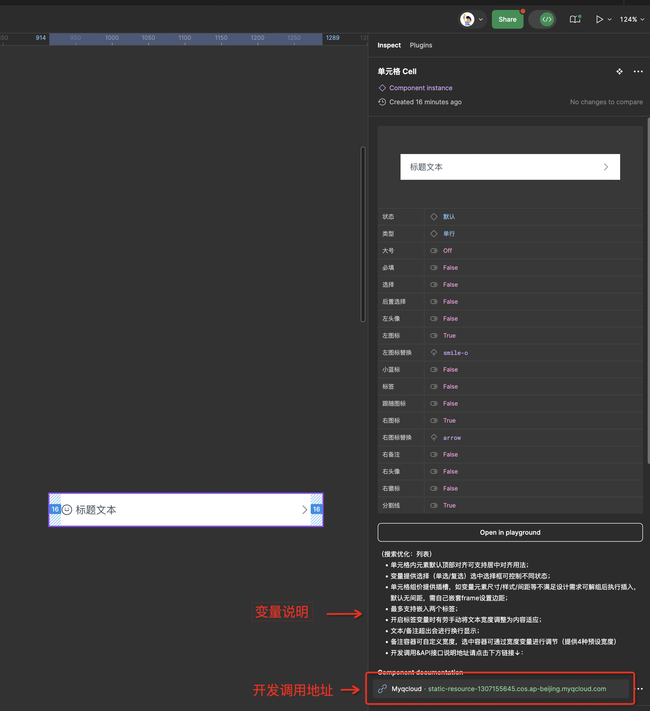
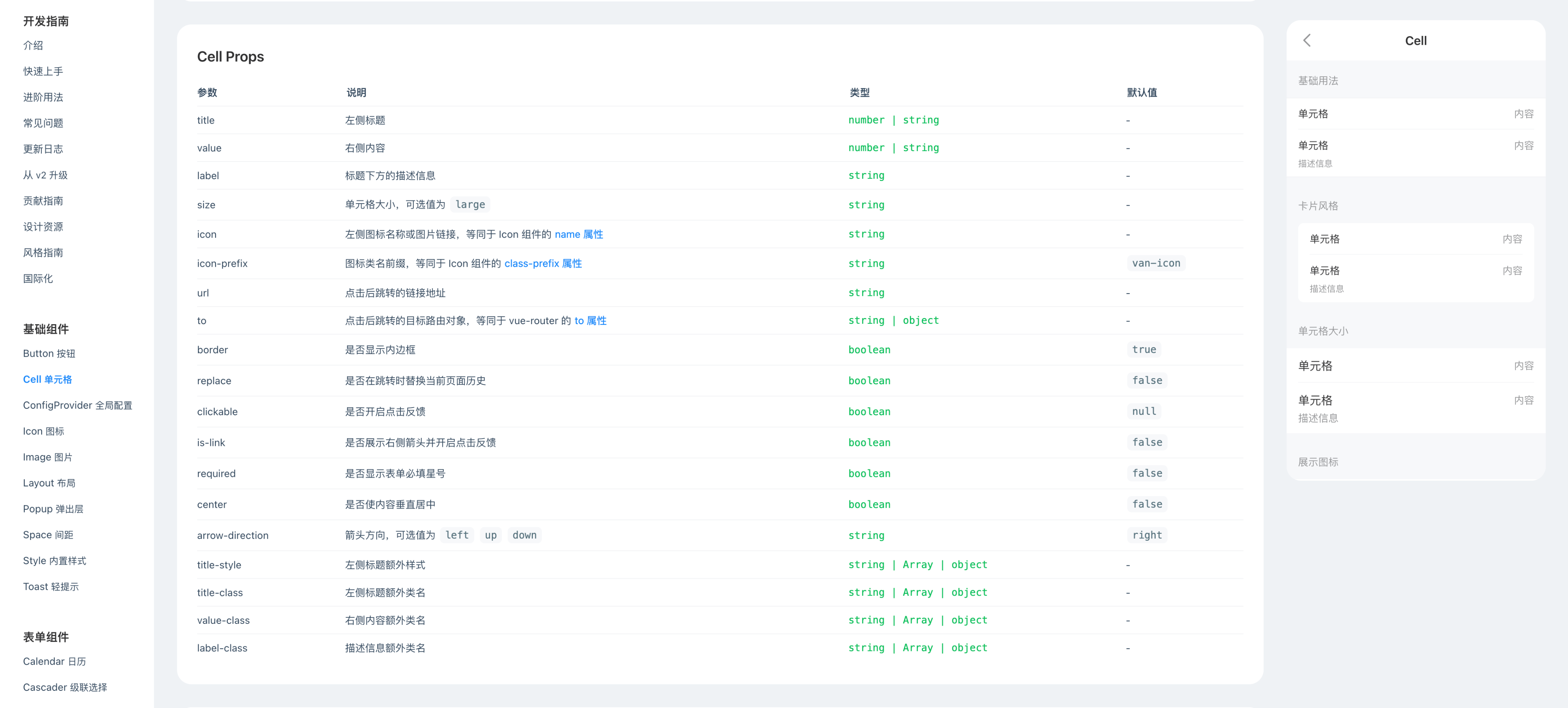
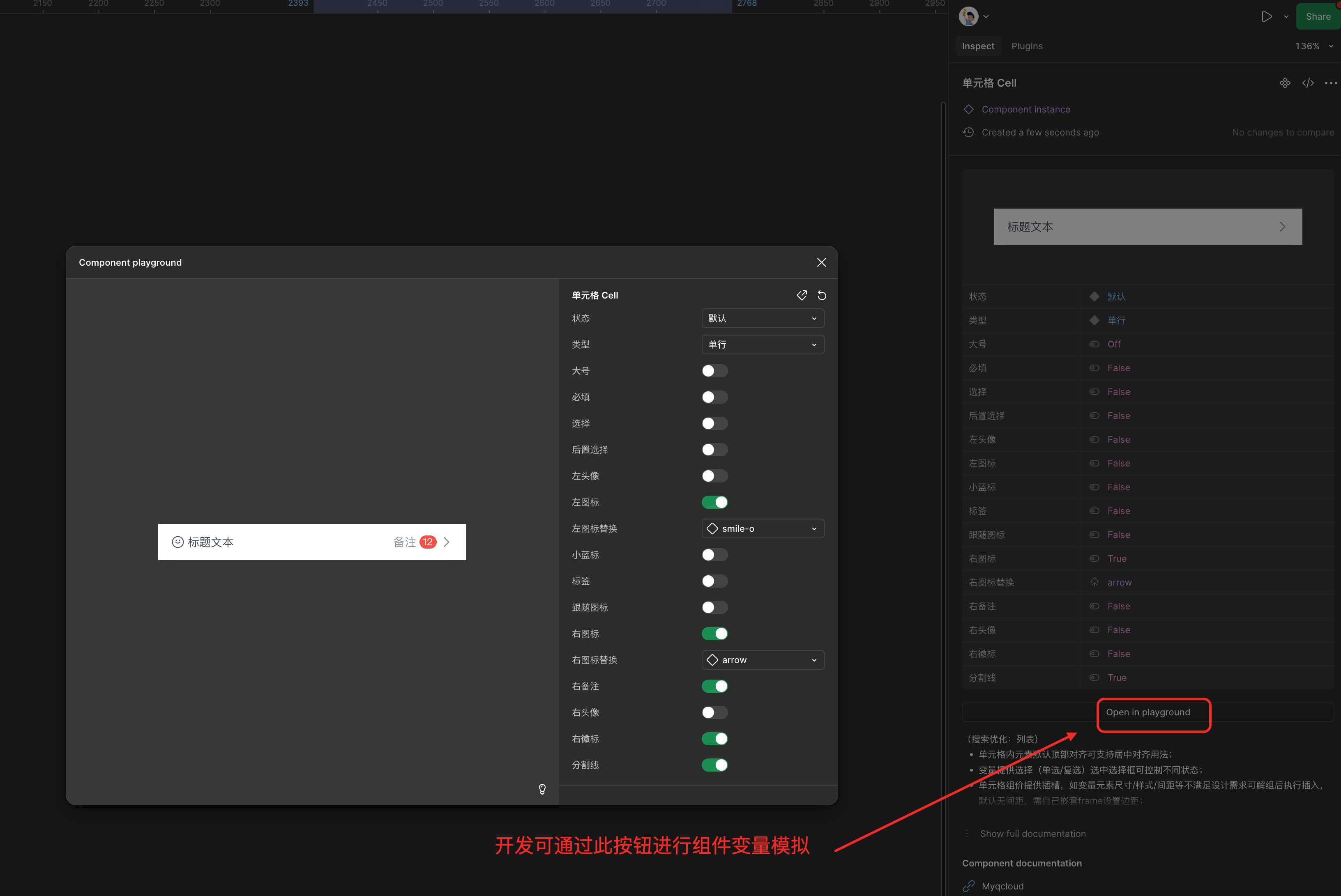
- Frontend developers can view the corresponding variable descriptions by selecting components in development mode. The bottom provides the development call address for the corresponding component. If there is a disagreement between designers and developers regarding whether certain components support specific usage methods, they can directly check the code-supported variables on the component website. Due to limited development resources, the current version of the component has been adjusted based on vant3, and some styles and functionalities may differ from the latest version of vant.
Meri Design
En
中
Design Call
- Team members can directly enable components through the component panel. Once enabled, they can search or find calls directly through the component panel. Non-team members can copy the documentation and publish components for use within their own teams. The component has been optimized for search keywords; for example, the [Cell] component can also be found using the [List] keyword. Icon naming has also been made compatible for search (supporting Chinese naming searches), aligning better with designers' search habits.
Design Component Variable Description
The component offers rich variable controls (different types and states, slot visibility control, quick icon replacement, etc.)
Single Component Usage Instructions
The component includes relevant usage instructions, such as usage specifications, extreme case handling instructions, and variable extensions supported by development.
Usage Instructions in Development Mode
- Frontend developers can view the corresponding variable descriptions by selecting components in development mode. The bottom provides the development call address for the corresponding component. If there is a disagreement between designers and developers regarding whether certain components support specific usage methods, they can directly check the code-supported variables on the component website. Due to limited development resources, the current version of the component has been adjusted based on vant3, and some styles and functionalities may differ from the latest version of vant.